Building New Windows into Digitized Newspapers
Andrew J. Torget and Jon Christensen
In building Mapping Texts we wanted to create more transparent windows into the extraordinary wealth of information available in online archives of digitized historical newspapers. We wanted, for example, to be able to see how much information was available for any particular time and place, and then measure just how much of that information was still recognizable — and thus useable — after the digitization process. We also wanted to be able to see the major language patterns coming from these datasets, so that we could use “distant” readings of such massive collections as a way to determine which individual newspapers would likely yield the most useful information from “close” readings. We wanted, in other words, more finely grained methods for indexing both the quantity and quality of information in these archives as they spread out across both time and space.
These are critical considerations for anyone conducting research. If a scholar cannot judge with any accuracy whether a particular archive has a sufficient amount of information about a particular time period, region, or subject, it becomes tremendously difficult — if not impossible — to determine whether that archive’s holdings would yield useful material for a given research project. And in most online archives of historical newspapers, those basic metrics are rarely accessible. If, however, we could develop new ways to expose and analyze those crucial pieces of information, we could enable scholars to make more informed choices about which datasets would be most useful to them in their research.
Our underlying purpose, then, was simply to enable better research in historical newspapers. And to that end we experimented with an online archive of 232,500 pages of historical Texas newspapers digitized by the University of North Texas’s Portal to Texas History. The resulting two interfaces — “Mapping Newspaper Quality” and “Mapping Language Patterns” -– each explore a different side of the archive’s holdings, one a quantitative view and the other a qualitative view. When used together, our hope is that the two interfaces will offer one possible model for how we might expose more clearly the full breadth and depth of information available in large collections of digitized historical newspapers.
MAPPING NEWSPAPER QUALITY
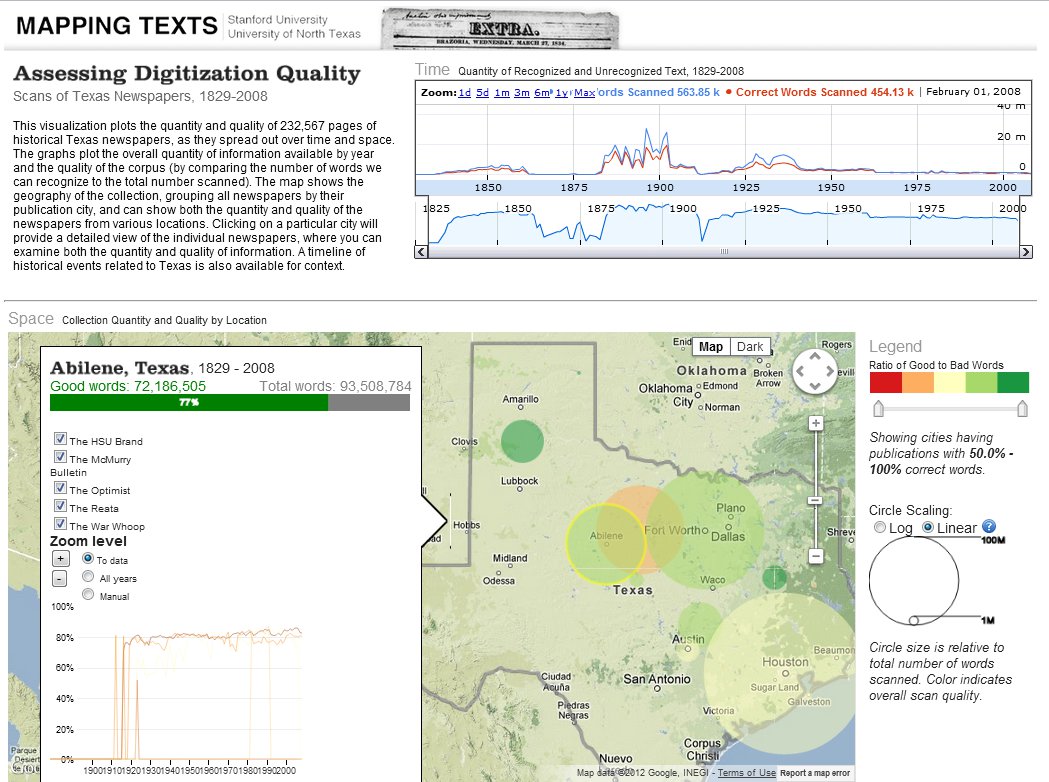
This interactive visualization plots the quantity and quality of information in the digital archive by geography and time periods, using both to survey the amount of information available for any given time, place, or individual newspaper. The entire corpus was broken down into recognizable words (words that could be matched against dictionary entries) and “noise” (words that were garbled by the OCR digitization process), and then plotted by time and location at the macro-level (that is, Texas as a region), the local level (individual cities), and the micro-level (individual newspaper titles). By allowing researchers to expose and explore both the volume and reliability of information available to them in a database of digital newspapers, our hope has been to enable scholars to make more informed choices about what research questions they can and cannot answer from a given collection of historical newspapers. (For more detail about the OCR process, the problem of “noise,” and our methods in recognizing and counting words, please see our White Paper.)
Mapping Newspaper Quality
Even a casual look at “Mapping Newspaper Quality” reveals important patterns. Although the entire newspaper archive represents 1829 to 2008, visualizing the quantity of data on a timeline reveals that newspapers within two smaller eras — 1883 to 1911 and 1925 to 1942 — vastly outnumber the representation from any other period (there is also a slight rise for the 1840-1860 era).
Mapping Quality Timeline
This reveals an important, although easily overlooked, fact about most digital newspaper archives: they tend to be strongest in subjects and time periods that garner grant funding. In this particular case, the UNT libraries digitized the bulk of their newspaper content according to the requirements of Chronicling America’s 2007 digitization grants (which concentrated on 1880-1910) and a private foundation grant (focused on the early twentieth century). Visualizing the volume of data available by time periods thus suggests that scholars of the Gilded Age and Progressive Era would be far better served by this particular dataset than would scholars of other time periods.
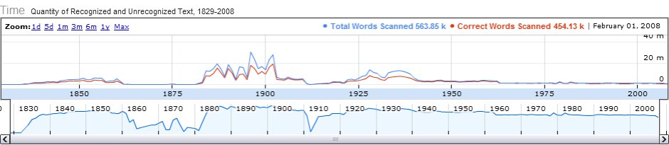
Adjusting the timeline also affects the other major window into the content: an interactive map of Texas. For the visualization, all the newspapers in the database were connected by their publication city, so the map shows the geographic distribution of the newspaper content by city. This can be adjusted to show the varying levels of quality in the newspaper corpus (by adjusting the ratio bar for “good” to “bad” words) in order to find the areas that had higher or lower concentrations of quality text. The size of the circle for each city shows their total content relative to one another — which the user can switch from logarithmic view (the default view, which gives a better sense of the proportional difference between locations) to a linear view (which provides a better sense of the absolute difference between locations).
Distribution of Information by City
Viewing the database geographically reveals that two locations dominate the collection: newspapers from Houston and Ft. Worth. Combined, these two locations outstrip the volume of information available from any other location in Texas, which is interesting in part because neither of those locations became dominant population centers in Texas until the post-World War II era (and therefore after the 1883-1911 and 1925-1940 time periods that compose the majority of the newspaper content). This would suggest that the newspapers of rural communities, where the majority of Texans lived during the Gilded Age and Progressive Era, are underrepresented among the newspapers in this collection, and that urban newspapers — and therefore urban concerns — are likely overrepresented. While scholars of urbanization would be well served by the collection, scholars interested in rural developments would be advised to be wary of this imbalance when conducting research in the archive.
Volume of information from Houston and Ft. Worth compared to other Texas cities.
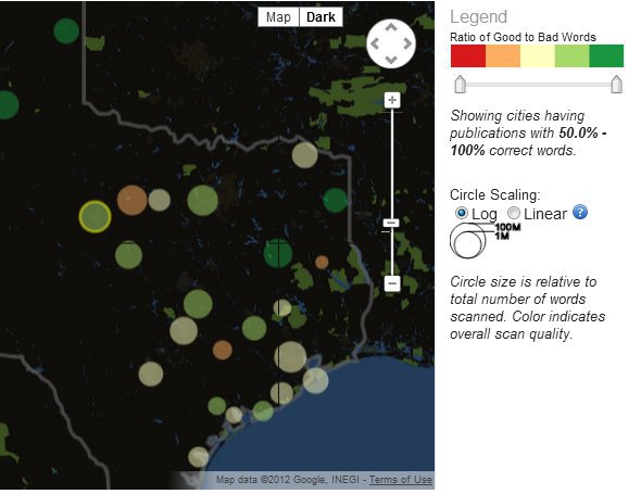
The third major window into the collection is the detail box that, for any given location (such as Abilene, Texas), provides a bar measuring the ratio of recognized words against noise, a complete listing of all the newspapers that correspond to that particular location, and the OCR recognition rates for individual newspapers:
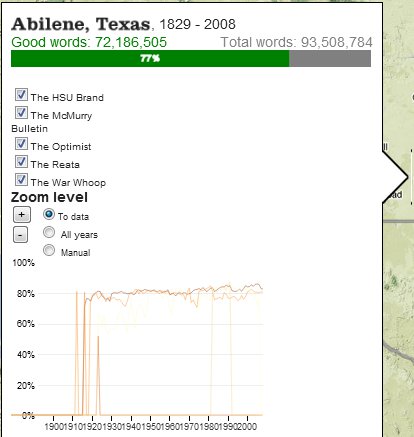
Detail window of information available from Abilene, Texas.
The detail box also provides access to the original newspapers themselves (as clicking on any given newspaper title will take the user to the original pages on the UNT’s Portal to Texas History), allowing users to jump from “distant” to “close” readings.
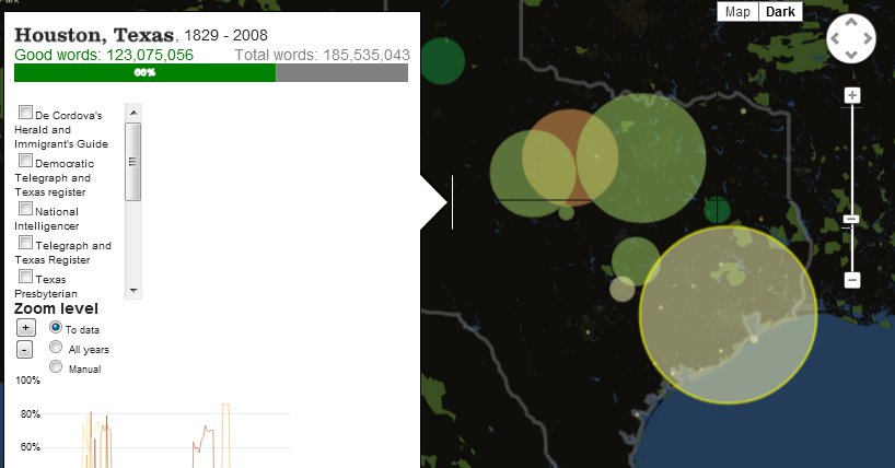
Exploring the various geographic locations with the detail box reveals more useful patterns about the information available in the dataset. Although Houston and Ft. Worth represent the locations with the largest quantity of available data, they are not the locations with the highest quality of available data. The overall recognition rate for the OCR of Houston newspapers was only 66 percent (although this varied widely between various newspapers), and for Ft. Worth the overall rate was 72 percent. By contrast, the newspaper in Palestine, Texas, achieved an 86 percent quality rate, while the two newspapers in Canadian, Texas, achieved an 85 percent quality rate. At the lowest end of quality was the OCR for newspapers from Breckenridge, Texas, which achieved only a 52 percent rate. Scholars interested in researching places like Breckenridge or Houston (which were both highly involved in the expansion of the Texas oil industry during the early twentieth century), then, would need to consider that anywhere between a third to fully half of the words from those newspapers were rendered unrecognizable by the OCR process. Scholars who decided to focus on newspapers from Palestine or Canadian, on the other hand, could rely on the high quality of the digitization process for their available content.
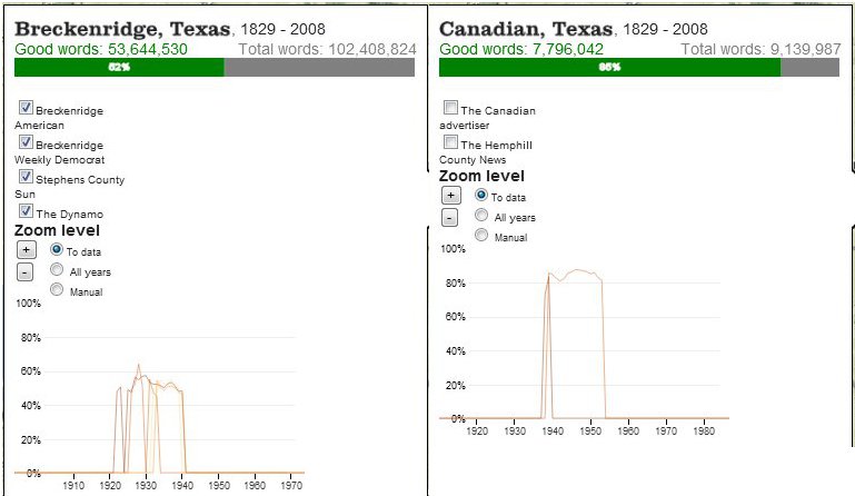
Detail windows on data available from Breckenridge and Canadian, Texas.
MAPPING LANGUAGE PATTERNS
For our second interface, “Mapping Language Patterns,” we built a qualitative survey of the language patterns in our digitized newspaper collection. We chose to focus on three of the metrics most widely used by humanities scholars for surveying language patterns in large bodies of text: word counts (ranked counts of all the words, minus extremely common “stop words” such as articles and conjunctions), named entity counts (ranked counts of named entities, such as people, places, and organizations), and topic models. (For greater detail about these metrics — particularly topic modeling — and our methods in generating them, see our White Paper.)
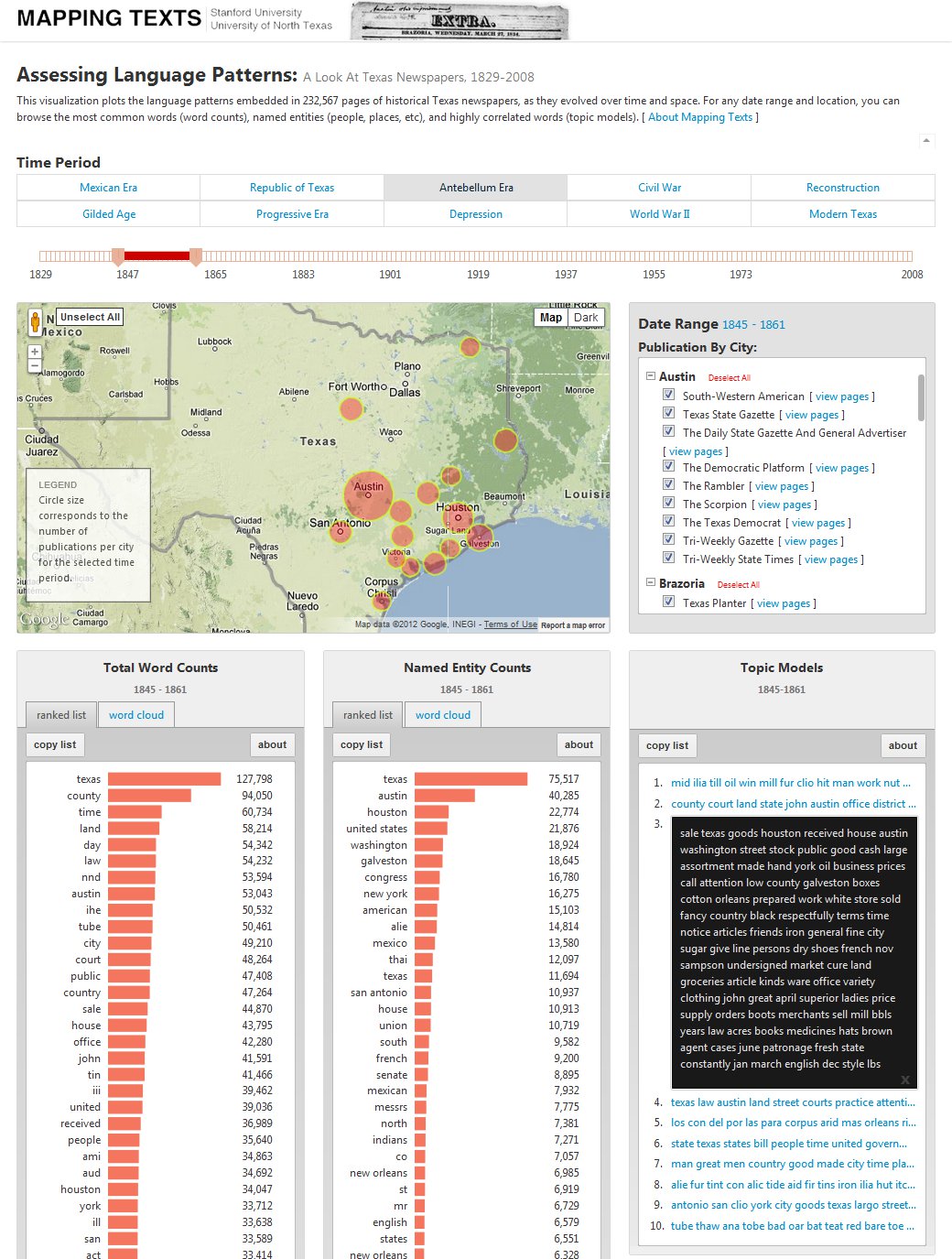
Mapping Language Patterns
Just as with our quantitative model, the user can select any time period from 1829 through 2008. For several reasons, we have also included pre-set buttons for historically significant eras in Texas and U. S.-Mexican borderlands history (“Mexican Era,” “Republic of Texas,” “Antebellum Era,” “Civil War,” and so on) which, if clicked, will automatically reset the beginning and end points on the time slider to those particular eras. (One of the key reasons for pre-setting the historical eras was that, due to the limits of current technologies, all topic models had to be preprocessed for specific time frames.) Once the user has selected a time frame, they can also customize the geography they want to examine. Based on the timeline selection, the map populates so that the user sees all the cities that have publications from the time period they selected. The user, then, can choose to examine all the language patterns emanating from all the newspapers relevant to their time period, or they could customize their selection to particular locations (such as Houston) or even a single newspaper title.
Once a user has selected a time frame and geography, they can then examine the three major language patterns which are displayed on the map in their own “widgets”:
Language Pattern Widgets
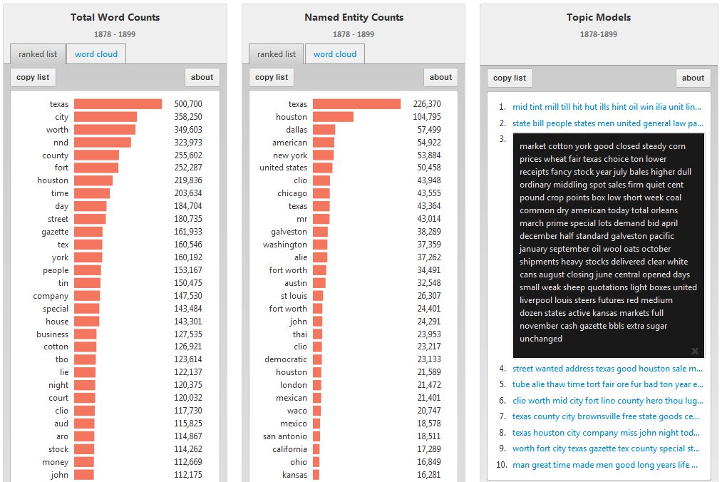
In the word counts and named entity counts widgets, there are two ways to explore the language data: (1) as a ranked list — with the most frequently appearing words at the top followed by a descending list — which reveals the most frequently used terms in the collection, and (2) as a word cloud that shows the constellation of words being used, with the size of the font indicating the relative rank of words in terms of frequency. Word clouds have become some of the most common and popular methods of displaying word counts, and we see a great deal of value in its ability to contextualize these language patterns. But we have also found that ranked lists of these same words are highly effective and offer a more transparent, direct method for displaying how these words relate to one another in terms of frequency.
In the topic model widget, the user is offered the top ten most relevant “topics” associated with a particular date range. Within each topic is a list of 100 words that have a statistical relationship to one another in the collection, with the first word listed being the most relevant, the second being the second-most relevant, and so on. The 100 words are truncated for display purposes, but clicking on any given topic will expand the word list to encompass the full collection, which allows the user to parse and explore the full set of topic models.
Each topic’s collection of words is meant to expose a theme of sorts that runs through the words in the newspapers selected by the user. Sometimes the topic is a collection of nonsensical words (like “anu, ior, ethe, ahd, uui, auu, tfie” and so on), when the algorithm found a common thread among the “noise” (words jumbled by the digitization process) and recognized a commonality between these non-words, which it then grouped into a “topic.”
More often, however, the topic models group words that have a clear relationship to one another. If, for example, the user were to select all the newspapers from the Republic of Texas era, one of the topic models offered includes “Texas, government, country, states, united, people, mexico, great, war . . . ” which seems to suggest that a highly relevant theme in the newspapers during this era were the international disputes between the United States and Mexico over the future of the Texas region (and the threat of war that came with that). That comports well, in fact, with what historians know about the era. What is even more revealing, however, is that most of the other topic models suggest that this was only one—and perhaps even a lesser—concern than other issues within the newspapers of 1830s and 1840s Texas, such as matters of the local economy (“sale, cotton, Houston, received, boxes, Galveston”), local government (“county, court, land, notice, persons, estate”), and social concerns (“man, time, men, great, life”), which have not received nearly as much attention from historians as the political disputes between the United States and Mexico during this period.
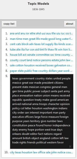
Topic models for Republic of Texas Era (1836-1845)
Some of the patterns fit neatly into standard interpretations of these eras. Discussions of war, for example, dominate the topic models for the Civil War, as do concerns about the collapsing cotton market during the Gilded Age. And across the different eras, concerns about public issues — such as economics, politics, and legal matters — dominate the conversations in the newspapers and can be seen most readily in the topic models.
More remarkable are the anomalies that emerge which do not fit neatly into how historians have typically described these eras. In comparing the ranked lists of named entities over time, for instance, there appears to be a focus among Texas newspapers on “New York” that began to rise during the 1840s and peaked during the late nineteenth and early twentieth centuries (during which time “New York” ranked consistently among the most frequently named locations). This may be a reflection of how intertwined the Texas economy of those years was with markets and financiers in New York; it may reflect the dominance of New York advertisements in the newspapers; or it may be related to other causes altogether. During the Civil War, “San Antonio” emerged as a highly prominent phrase in word counts, named entities, and topic models — which is remarkable, since the city played no prominent role in the state’s war effort. And it was not until the Depression of the 1930s that sports becomes a significant theme in the Texas newspapers of this archive (which may reflect the fact that college newspapers make up a large proportion of the archive during those particular years), even though sports had been an important part of early twentieth century life in the state before the collapse of the American economy. Each of these patterns could suggest possible lines of new research and study for humanities scholars and help guide their forays into the digital archive.
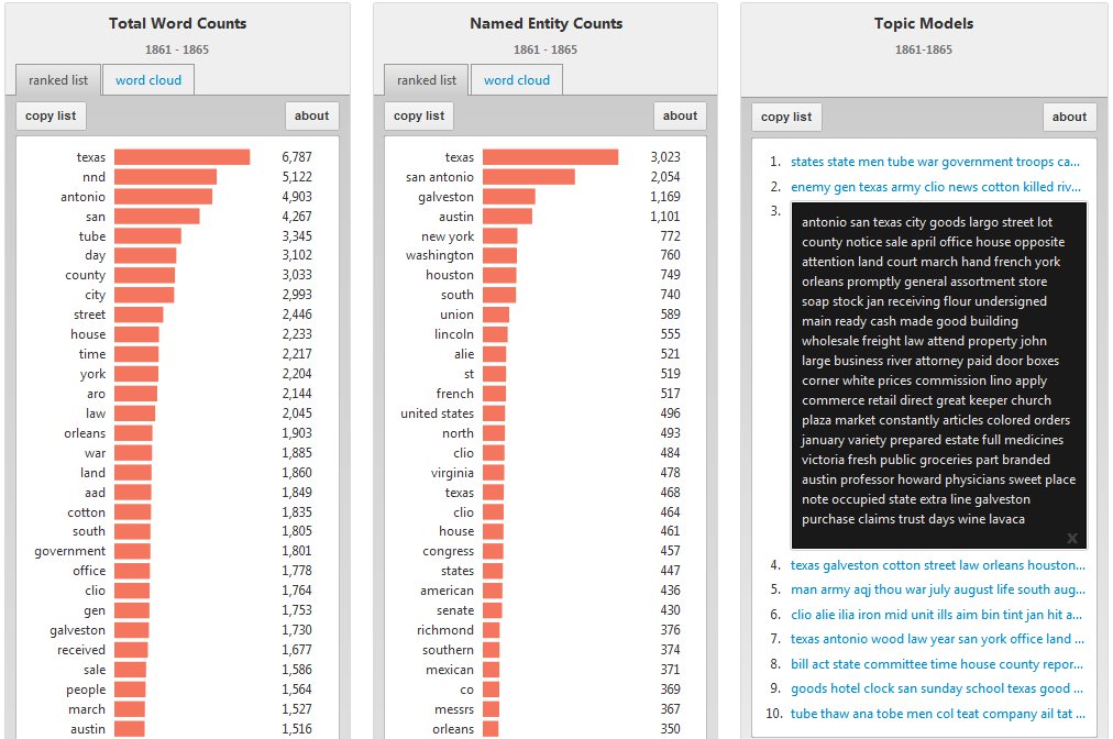
Topic Models for Civil War Era (1861-1865), where “San Antonio” appears prominently.
Digital humanities scholars and technologists are rapidly developing new tools for exploring, analyzing, and interpreting the massive new databases of text, and “Mapping Texts” does not stand alone. It was designed to fit into an emerging ecosystem of tools, processes, and methods in text-mining, analysis, and visualization. The true proof of the utility of this experiment, however, will come if these tools prove useful in shaping the questions that scholars ask, in guiding their use and interpretation of these digital archives, and if any of the array of analytical and visualization technologies that we have combined here are more widely adopted for exploring the vast digital archives that are increasingly becoming available for humanities scholars.